!pip3 install --upgrade seaborn # Updates the seaborn version in the collab notebook.
import warnings
warnings.filterwarnings('ignore')
Box plot
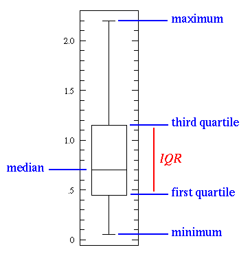
Box plot, also called the box-and-whisker plot:
- a way to show the distribution of values based on the five-number summary: minimum, first quartile, median, third quartile, and maximum.

Median
The median is the value that separates the higher half of a data from the lower half. It’s calculated by the following steps: order your values, and find the middle one. For example, if we have the numbers 1, 3, 4, 7, 8, 8, 9, the median will be 7.
First quartile
The first quartile is the median of the data values to the left of the median in our ordered values. Ex: For the numbers 1, 3, 4, 7, 8, 8, 9, the first quartile will be ?
Third quartile
The third quartile is the median of the data values to the right of the median in our ordered values. Ex: For the numbers 1, 3, 4, 7, 8, 8, 9, the Third quartile will be ?
Interquartile Range(IQR)
The IQR approximates the amount of spread in the middle 50% of the data. The formula is the third quartile - the first quartile. Ex: For the numbers 1, 3, 4, 7, 8, 8, 9, the IQR will be ?
Outlier
An outlier is a data value that lies outside the overall pattern. A commonly used rule says that a value is an outlier if it’s less than the first quartile - 1.5 IQR or high than the third quartile + 1.5 IQR.
Maximum and Minimum
The minimum and the maximum are just the min and max values from our data. (outliers are not included)
import seaborn as sns
sns.set(style="whitegrid")

tips = sns.load_dataset("tips")
sns.boxplot(y=tips["total_bill"])
sns.boxplot(x="day", y="total_bill", data=tips)
Excercise
- Draw a boxplot for smoker and non-smoker for the above plot.
- Draw the boxplot for males and females for the above plot.
# @title Please try yourself
# Hint: Remember `hue` from last class?
Use swarmplot() to show the datapoints on top of the boxes:
sns.boxplot(x="day", y="total_bill", data=tips)
sns.swarmplot(x="day", y="total_bill", data=tips, color=".25")
sns.catplot(x="day", y="total_bill", data=tips, kind='box')
What Is Correlation and Why Is It Useful?
Correlation is one of the most widely used — and widely misunderstood — statistical concepts. In this overview, we provide the definitions and intuition behind several types of correlation and illustrate how to calculate correlation using the Python pandas library.
The term "correlation" refers to a mutual relationship or association between quantities. In almost any business, it is useful to express one quantity in terms of its relationship with others. For example, sales might increase when the marketing department spends more on TV advertisements, or a customer's average purchase amount on an e-commerce website might depend on a number of factors related to that customer. Often, correlation is the first step to understanding these relationships and subsequently building better business and statistical models.
Why is correlation a useful metric?
- Correlation can help in predicting one quantity from another
- Correlation can (but often does not, as we will see in some examples below) indicate the presence of a causal relationship
- Correlation is used as a basic quantity and foundation for many other modeling techniques

Correlation in Pandas
df.corr()
tips.corr() # That was easy, right?!!
Heat Maps
Visualizing data with heatmaps is a great way to do exploratory data analysis, when you have a data set with multiple variables. Heatmaps can reveal general pattern in the dataset, instantly.
- It is very useful in visualizing the concentration of values between two dimensions of a matrix.
sns.heatmap(tips.corr(), linewidths=.5)
Titanic Correlation
import pandas as pd
titanic_df = pd.read_csv('https://raw.githubusercontent.com/nphardly/titanic/master/data/inputs/train.csv')
sns.heatmap(titanic_df.corr(), linewidths=.5, cmap="RdBu")
Excercise
What are the top two most correlated features in the dataset? Pclass and Fare, Sibsp and Parch
Plot the relation graph between top two most correlated data in the titanic dataset (Hint: remember sns.relplot?)
Bar Plot
A bar plot represents an estimate of central tendency for a numeric variable with the height of each rectangle and provides some indication of the uncertainty around that estimate using error bars
sns.barplot(x="day", y="total_bill", data=tips)
Excersise
- Plot the bar plot of total bill for Males and Females across days.
# @title Please try yourself
Lets Explore a new DataSet- GapMinder
It provides the average life expectancy, gdp per capita and population size for more than 100 countries.
data_url = 'http://bit.ly/2cLzoxH'
gapminder = pd.read_csv(data_url)
gapminder.head(10)
Develop insights about this new dataset
- Average LifeExp of people country wise
- Average gdpPercap of people continent wise
- Plot relation between gdpPercap and LifeExp
... go on and discover some interesting relations
# @title Please try yourself
# No solution this time.
sns.relplot(x= 'year', y = 'gdpPercap', data=gapminder, kind='line')
Can we make the plots more informative?
Hint: catplot, relplot, countplot, pairplot?
Learn Yourself
- https://seaborn.pydata.org/api.html Explore interesting features and plot by yourself